
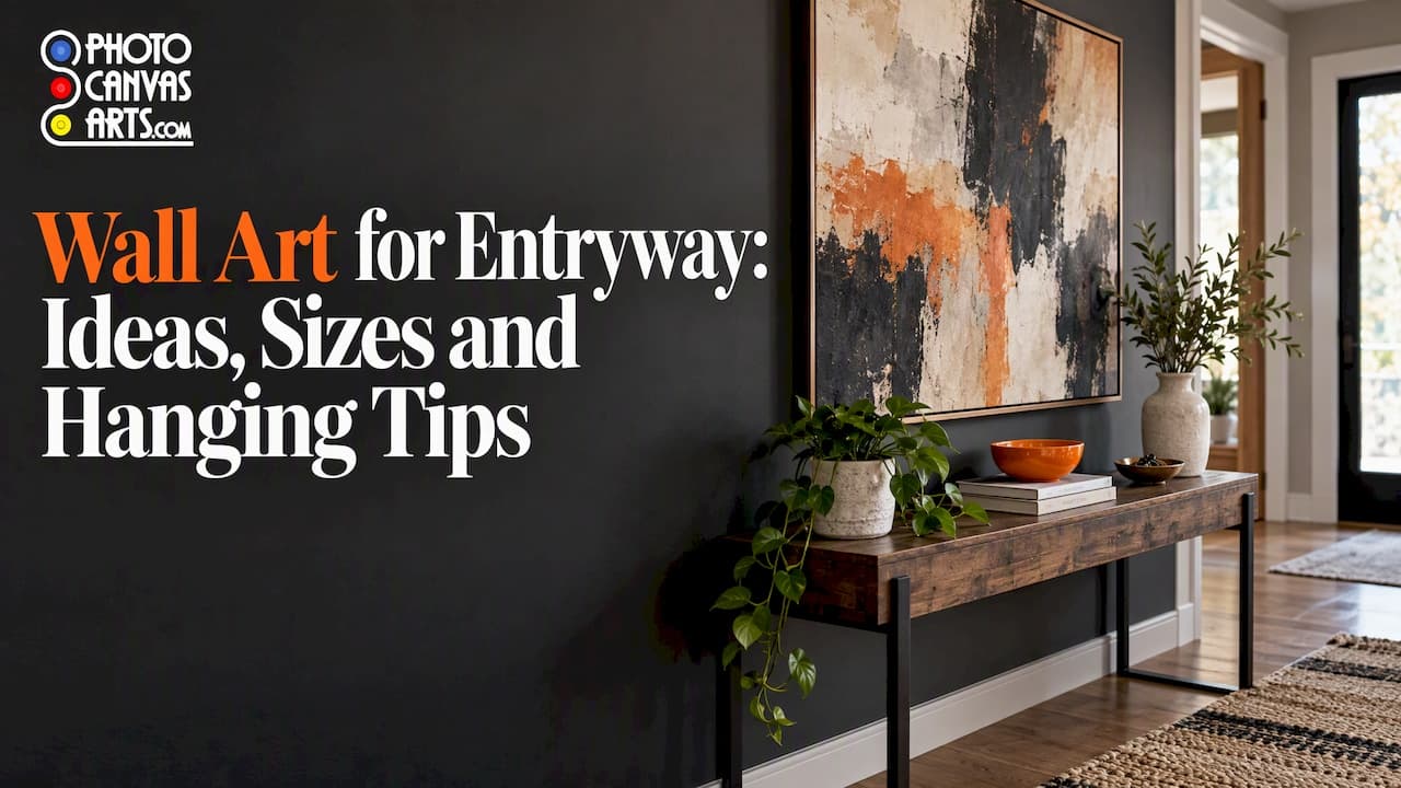
The best wall art for an entryway is one confident piece, or a tight group, that sets the tone for your home, fits the wall's proportions and stays clear of coat hooks and door swings. Get the color, scale and height right and a small foyer feels intentional. Get them wrong and even beautiful art looks lost. This guide walks through each decision, then shows how to make the art personal with your own photos or artwork.
TL;DR
- Treat the entryway as a preview of your home: echo its color scheme and personality in one clear focal piece.
- Match the shape to the wall. Vertical art suits narrow walls, horizontal art suits a console or bench, and a common rule of thumb for art over a console is about 60% to 75% of the console's width.
- Hang entryway art a little higher than usual, because people see it standing up. Keep it away from hooks and door swings.
- Your own photos and artwork make the most memorable entryway art, as long as the file is sharp enough for the print size.
Table of Contents
- What entryway art is actually for
- Choose a style and palette first
- Size and shape: match the art to the wall
- Arrangements that work in an entry
- Hanging height and placement
- Canvas or paper for an entryway
- Using your own photos or artwork
- Our perspective
- Turn your image into entryway art
- FAQ
- Sources
What entryway art is actually for
An entryway is the first thing a guest sees and the last thing you see when you leave. Design editors describe a thoughtfully styled entry wall as having a major design impact that sets the tone for the rest of the house. That is the job of the art: it introduces the home.
House Beautiful's advice is to treat the entry as a preview of the home's color scheme and personality, and to use large-scale art to bring in personality without adding clutter on the floor. That second point matters in small entries. You rarely have room for furniture, but you almost always have a wall.
Three practical consequences follow:
- Entryway art is seen in passing. People walk past it with keys in hand. Clear shapes and strong contrast read better than fine detail.
- It has to connect to what comes next. If the entry opens into a calm, neutral living room, a wildly different palette will feel disconnected.
- It lives in a working space. Bags, coats and kids brush past it, so mounting and protection matter more than in a bedroom.
Choose a style and palette first
Decide on the mood before you pick a subject. Here are directions that work reliably in entries.
Landscapes and nature
Landscapes are a classic entry choice because they open up a small space visually. Better Homes & Gardens shows how a landscape can make a foyer feel like the outdoors when it hangs against a neutral background. Think a misty treeline, a coastline, a desert horizon or a favorite hiking view you shot yourself.
Abstract and graphic work
Soft abstracts add color without demanding attention, while high-contrast graphic pieces suit a space you pass through rather than sit in. If your entry is dark or has rustic paneling, a modern piece with a light frame can stand out sharply against it, an approach also covered in that same gallery wall roundup.
Black and white
Monochrome photography or line art is the easy answer when the adjoining rooms are busy. It gives the eye a rest and works with almost any floor, paint or furniture finish.
Botanicals and watercolors
Plants, florals and loose watercolor washes bring softness to a hard-surfaced entry full of tile, wood and metal hardware. If you paint, our guide on how to choose, prepare and order watercolor art prints covers getting delicate color and paper texture to survive the move from original to print.
Building the palette
The simplest method is to pull two or three colors from what is already there: the wall, the console, the rug, a runner or a bench cushion. Another option is one deliberate contrasting piece against a restrained backdrop. Architectural Digest's styling experts say a room works best when objects tell a color story, with like colors combined and color placement flowing across the space. In an entry, that story usually continues into the next room, so glance through the doorway before you commit.
A quick test: hold a sample of your art, or a printout, next to the nearest large object. If one color echoes, you are on track. If nothing connects, either change the art or add a small link such as a vase or throw in a matching shade.
Size and shape: match the art to the wall
The most common mistake with wall art is scale. Better Homes & Gardens notes that choosing a piece that is too small or too large is a typical problem when hanging art over furniture. Entries make this worse because walls are often short, narrow or interrupted by doors.
| Entryway situation | Best shape | Why it works |
|---|---|---|
| Narrow wall beside a door | Vertical (portrait) | Draws the eye up and uses height instead of width |
| Wall above a console table | Horizontal (landscape) | Echoes the table's line; aim for roughly 60% to 75% of its width |
| Low bench with limited wall above | Panoramic or wide horizontal | Fills the width without needing height |
| Tall foyer with high ceiling | Large vertical, or a stacked pair | Fills the volume instead of floating in it |
| Small, tight entry | One medium piece, or a slim vertical | Avoids crowding a space people pass through |
Narrow or small entries
Vertical formats are the natural fit for slim wall sections, and they pull the eye through the whole height of the picture. If your entry is tight, resist the urge to hang several small pieces. One well-sized vertical piece looks calmer and more deliberate than a scatter of frames.
Above a console or bench
Horizontal art works well over a long console or bench, and panoramic formats suit a low bench or a wide wall with limited height. Measure your furniture, then multiply. A 40-inch console suggests art roughly 24 to 30 inches wide. Cut paper templates to that size and tape them up before you order.
Large, open foyers
With more room, you can go big. One oversized canvas becomes the room's centerpiece, and a pair of matching pieces adds symmetry. Better Homes & Gardens suggests one large statement piece above an entry console, or a large piece whose colors echo the console and frame while the surrounding decor stays minimal.
Arrangements that work in an entry
You have three realistic options:
- One statement piece. The cleanest answer for narrow or small entries and for strong images.
- A matching pair. Two panels side by side or stacked give a formal, balanced look, ideal flanking a door or mirror.
- A small cluster or gallery wall. Best where you have a generous wall and several images that belong together.
Building a gallery wall
Start with a larger anchor piece in the center, then arrange smaller pieces around it, as layout guides from The Spruce recommend. Formal grids suit orderly interiors, while organic groupings suit more relaxed ones, according to Better Homes & Gardens, which also notes that gallery walls can mix family photos, art and collectibles.
A few rules keep entry galleries from looking messy:
- Keep a consistent spacing between pieces, typically two to three inches.
- Limit the palette. Mixed sizes look curated when the colors repeat.
- Lay everything on the floor first, or cut paper templates and tape them to the wall.
- Keep the whole group to a manageable width. In an entry, a gallery wall that sprawls feels like clutter.
Layering with furniture
If you have a console, you can lean a smaller piece against the wall in front of a larger one for a relaxed, layered look, another idea from Better Homes & Gardens' console styling guide. Canvas works especially well here because it is light and has no glass to reflect the entry light.
Hanging height and placement
The standard answer is to center pictures about 57 inches from the floor. The Spruce points out that in entryways, where people tend to be standing, hanging higher than that may make sense, particularly with tall ceilings, with figures of 60 to 62 inches mentioned as the point where you might go above standard. If you are over a console, relate the art to the furniture first: leave a gap of a few inches above the table so the two read as one group.
The same guide suggests trying different heights and locations before you put holes in the wall, and using paper templates to do so. It is the cheapest way to avoid patched drywall.
A few more entry-specific cautions:
- Check the door swing. Open every door fully and make sure the art, and its edges, will not be hit.
- Keep clear of coat hooks. Art hung above or near hooks gets bumped, and wet coats are not kind to prints.
- Match the hardware to the weight. HGTV recommends sawtooth hangers for lightweight pieces and eyehooks with picture wire for larger or unevenly weighted art.
- Think about kids and pets. In homes with active children, the same HGTV guide advises acrylic instead of glass for framed pieces. Unframed canvas sidesteps the issue entirely.
Canvas or paper for an entryway
Both work. The choice comes down to the wall, the traffic and the look.
Canvas has a textured, painterly surface, no glass and a lighter feel. A gallery wrap, where the image continues around the edges, is designed to hang without a frame, which suits a narrow entry where a frame would add bulk. A slim-profile canvas sits closer to the wall, handy where people brush past.

Paper prints suit crisp photography, line art and detailed illustration. They look sharpest in a frame with a mat, and they let you swap frame style to match a console or mirror. Fine art paper brings a soft, gallery feel to an entry with restrained decor.
Finish matters too. In an entry with a window or glass door, glare can wash out a glossy print. Our guide to choosing between matte and glossy photo prints explains how each finish behaves in different light, which is worth reading before you order for a bright foyer.
Using your own photos or artwork
Generic art fills a wall. Personal art says something about who lives behind the door. There are four dependable ways to do it.
A single landscape from your own travels
A photo from a trip, a family cabin or a favorite trail gives an entry a story guests will ask about. Choose images with a clear focal point and a simple composition, since they will be seen at a glance.
A family portrait or gallery of moments
Family photos in a hallway are a classic for good reason. To keep them looking designed rather than accidental, unify them: convert them all to black and white, or choose images with a shared color tone, then print them in a consistent format. Mixed sizes in one palette look collected, not cluttered.
Your original artwork
If you are an artist, your entry is a natural place for a large print of your best piece. A print lets you hang a bold version at home while keeping the original safe, and it gives you the same piece in multiple sizes for different walls.
A detail shot
Close-ups of texture, such as bark, waves, fabric or a brushstroke, work as abstract art and tend to survive heavy enlargement better than busy scenes.
Check the file before you order
Before uploading, check three things:
- Resolution. Large prints need a large source file. A phone photo taken in good light is usually fine for a medium print, but a heavily cropped or low-resolution image will look soft when enlarged. A live preview helps you see how cropping will fall.
- Cropping. Gallery-wrap canvas continues the image around the edges, so leave breathing room around important subjects.
- Color. Screens are backlit and prints are not. Slightly brighten very dark images and avoid relying on subtle shadow detail.
If you are planning art for a child's space as well, our playroom wall art guide covers choosing pieces that grow with your kids, and the same logic extends to a family entry.
Our perspective
We print for artists, families and businesses, and entryways are among the walls people care about most and plan least. The pattern we see is that people start by browsing images and end up second-guessing size. Our advice is to work backward: measure the wall, tape up paper templates, decide whether the piece should be vertical or horizontal, and only then choose the image.

We also think the entry is the best place in a home for something personal. A well-chosen stock image is fine. A photo you took, or a piece you painted, is better, because it gives a guest something to ask about before they have even taken off their coat. That is why we built our service around easy upload, a live preview so you can check the crop and format, and a choice of canvas and paper, sizes, finishes and edge styles. You should be able to see how a piece will look before it ships.
Finally, treat the entry as a working space. Choose a mounting option that fits the traffic, keep art out of the swing of the door, and give the piece the height it needs to be seen. A good entry piece should look as if it has always belonged there.
— Diego
Turn your image into entryway art
If you already have the photo or artwork, you can upload it, pick a format and preview it before you order. We print on handcrafted canvas, including gallery-wrap and slim-profile options, and on premium art paper in matte and fine art finishes. Start on our canvas and paper print page and choose the size that matches the template you taped to your wall.
FAQ
What size art should I hang in a small entryway?
Choose one medium piece or a slim vertical rather than several small ones. If the art goes above a console, a common guideline is roughly 60% to 75% of the console's width. Tape a paper template to the wall first to see how it feels in the space.
How high should I hang art in an entryway?
Pictures are usually centered about 57 inches from the floor. The Spruce notes that in entryways, where people are standing, going higher can make sense, especially with a tall ceiling. If the art sits above a console, relate it to the furniture and leave a few inches of gap.
Is canvas good for entryway wall art?
Yes. Canvas is lightweight, has no glass to cause glare and a gallery wrap hangs without a frame, so it suits narrow, high-traffic entries. Keep it away from door swings and coat hooks. For crisp photography or line art, paper prints in a frame are an equally good option.
Can I use family photos in my entryway?
Absolutely. To make them look designed, unify them with a shared color treatment such as black and white, a consistent format and even spacing. A larger anchor image with smaller pieces around it works well for a group, as gallery wall layout guides suggest.
What colors work best for entryway art?
Pull two or three colors from your wall, furniture or rug and echo them in the art, or choose one contrasting focal piece against a quiet backdrop. Look through the doorway into the next room, since entry art should feel connected to the rest of the home.
Sources
- 22 Entryway Wall Ideas That Make a Great First Impression, The Spruce
- 77 Inviting Entryway Ideas for Your Home in 2026, House Beautiful
- 38 Gallery Wall Ideas That Feel Modern and Timeless, Better Homes & Gardens
- 8 Expert Tips for Styling Surfaces in Every Room, Architectural Digest
- How to Arrange Art for a Flawless Wall Display, Better Homes & Gardens
- 25 Console Table Decor Ideas to Spruce Up a Hallway, Better Homes & Gardens
- Guide to Gallery Wall Layouts, The Spruce
- How High to Hang Pictures: Design Expert Rules, The Spruce
- How to Create a Family-Friendly Entryway Gallery Wall, HGTV